You know too much
At MediaBox, every project starts with a design brief which helps us set a direction and understand the objectives for each job. In these briefs, we include information such as the project’s intended target audience ¬
Because it is easy to forget that typically we are not the target audience for our projects, in this post I want to highlight the value of forgetting preconceptions when analizing design proposals, and the great impact this has over effective design choices ¬
A target audience can be identified by demographics such as their geographic location, culture, income, age, etc. For this example, just talking about target audience age, should be graphic enough (pun intended) ¬
Looking at variables such as your audiences’ age, some things come to mind naturally – e.g. large type for young and older audiences. However, other conditions are just as important and more easily influenced by our biases, making it harder to be objective at gauging design solutions for effectiveness ¬
 For example, most of us grew up receiving mail via the post office, and so, when we need to denote email via a symbol, we sometimes use an envelope’s icon. However, how realistic is to expect that this icon, and not (as an example) the “@” sign, be more adequate when talking to an audience of under 25 years of age? After all, email started replacing envelope-and-stamp mail in the early 90’s*. At the moment we are still safe with the envelope skeuomorphism, but not for long ¬
This is why we find that in heraldry – effective brands that lasted generations – there are few man created objects used in symbols, and instead, we have used elements from nature such as plants and animals, which do not go out of style or are replaced by newer technologies ¬
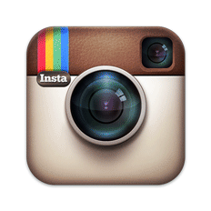 We do continue to use technology associated symbols for different reasons, and these are justified. Instant Polaroid has come and long gone, but Instagram is very much “in”, and so, we use an icon that reassembles a Polaroid camera for nostalgia sake (and because it is hip), even with an audience that did not experience the real McCoy first hand ¬
In closing, I am 51 years old at the time I write this, but when designing for a specific target audience, I try to be in their shoes, sneakers or flip-flops. My message is always addressed to them. Not to my client, not to my personal biases, but to the factual realities of that audience’s framework ¬
We need to remember the work we do is for them and not for us
* Electronic messages, via the Internet, have been around since the 1950s. The Internet became affordable and the personal computer became affordable by the early 1990s. By 1994, a 25 year old of 2013 was already 6 years old.